Create Your First Project
Start adding your projects to your portfolio. Click on "Manage Projects" to get started
UCCS Program Page Redesign
Project Type
UX/UI Design
Began
Late February 2025
Ended
May 2025
Role
Project Manager, UI/UX Designer
In my senior year UX Design Principles course, I led a team in collaboration with the lead UX Designer at UCCS to redesign the university's program pages. Over three months, we conducted online client interviews to identify pain points and understand the desired changes as well as establish a relationship with the client in the process. Using this data, we created a user persona that reflected the client's expectations, along with wireframes of the site layout. We then tested prototypes in class, iterated multiple drafts and final mockups based on peer and user feedback, and, upon project completion, presented the final design to the client, from sketch mockups to the individual prototypes, ending with a tour of the final product, all using Figma.
This project pushed my skills further into advanced Figma usage, client-centered design, and fast paced project management. Challenges here included reworking our user persona mid-project after conflicting client and instructor feedback, requiring a fast redesign under tight deadlines, and learning a new program during development. There was also an extreme change of process through user testing done during lectures which caused constant re-designs of the prototypes between back and forth versions until a balance was met between both usability and dynamic content. Through this experience, I also greatly strengthened my UX/UI design abilities, team coordination, and adaptability under pressure.
The slideshow below showcases key stages of the development process centered around both client feedback and persona needs using the areas of the prototype I worked with the most. Along with this, the button at the top of the page will lead you to the site links page to view the full individual project pages from wireframe to final product.


After discussing with our professor, this model and Task 3 was scrapped in favor of a more relevant model based on extra suggestions given by the client in terms of favoring a more traditional student body that does make up a larger majority of the campus population.


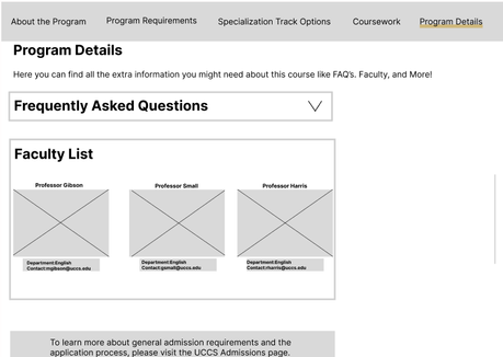

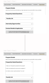
Given this was a low fidelity draft still, the representation of the nested information being dropped down was represented using individual frames in Figma, with updated information depending on the drop down. Overall this wireframe still followed a "user flow" format as it was directed from frame to frame similar to how our sketches had been at that stage to better understand how to transition the design into a workable prototype.

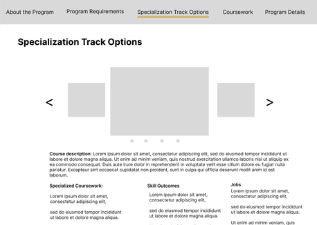


This page reflected some major user feedback from that lecture, which for my user task included adjusting the layout of the drop downs from vertical to horizontal, and creating a more "card" like structure for them. Along with this came a lot of the basic formatting developments from the university such as standardizing the text for links to be blue indicating they can be clicked on, as well as the formatting for the header of the page along with a navigation bar at the top. The faculty drop down was also reworked into a card which was designed to be imbedded with the page that actually contained the faculty, which within the prototype was able to be scrolled through.


As a result each card was given its own section with individual bars separating them, and all accordions removed. Along with this, user testing found the faculty window to be far too cramped given how much faculty was involved and felt it was far too small given the importance of it. So as a result, the idea I came up with was to remove the faculty page entirely in this design and replace it with a dedicated section for the department advisors, as they were not present anywhere on the main page, and our persona within task three was looking for extra program details, something that the advisors fit perfectly.
If you want to see this design change in more detail I would recommend checking out the Prototype 2 link directly on the site!


Overall users still found that the page was not as inviting as it could be for a prospective student, and so the first major change made in that area was to include much more welcoming text through all of the headings and sections, explaining not only what it is but also maintaining a high energy and friendly tone with the user to create a more lively page.
There was also a suggestion made to include something beyond just a header leading right into the next section, which led to the creation of a potential built in video window that was meant to show prospective students a rundown of what makes this particular program so special, which would be recorded by the chair of the department. This set a much more developed entrance to the page and would establish to the user that the program takes itself seriously and looks to assist the user wherever it can.

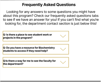
As a whole along with the subheading below, the individual questions had been split into their own accordions, which then had been given a the color code of gold specific to the university. Along with this, the overall interaction became more dynamic, with adjustments made to the states of the variants to change color and move a little when dropped down. At this point the link colors had also been changed from blue to gold, which was a mistake on my end as a designer as I had been referencing the dark mode version of the actual page, and swapped them over for coherence in design. This would change back in the final iteration.
At this stage I had also learned how to navigate Figma far more, and was able to add in the hugging option for each drop down, allowing for them to move when one was expanded above it. This compromise was just about the final version of this drop down, and most changes from here on out were cosmetic and color.

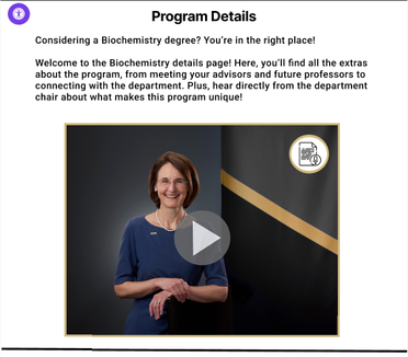
This is generally the same home page from prototype three, which had both a heading and a video at the start. The heading was given a slight rework to be more friendly, and the video was adjust in size and given a pop out when clicked on. For accessibility, and aligning with our client goals of such, we added in an option to open a transcript of the video, which all follows the color and design standards set by the university. Along with this the play and exit buttons were given hover over animations and color reflecting that standard as well.


Along with this, an image representing the research mentioned was added as a placeholder as the marketing department had no images left for chemistry based tasks. Following a review of the university webpage in light mode, using the variants feature again, which at this stage I had gained a proficient grasp in, I created a hover over effect in which the shade of the blue was changed and the text was underlined to avoid having permanent underlined text. This was however the only addition made to the page as it did not need more adjustment beyond this.


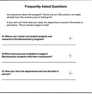
A long with this, the drop down visual was vastly reworked to follow the same standards the university had implemented into their drop downs. Upon highlight the plus icon would change into a light shade of the gold that is used, and then when clicked on, both the bar and plus sign would permanently change to the proper gold in this state to indicate it being open, along with a spin animation added to the plus icon as it was dragged out, with the reverse happening when it was closed to return it to its base state.
At this stage I had grasped a proficient scope of Figma and was able to make these changes throughout each dropdown, along with clipping content to cut off and become scrollable if multiple were selected and caused the information to expand outside of the section. This final change to the design was kept within the presentation to the client, which was found in line with their expectations.


After discussing with our professor, this model and Task 3 was scrapped in favor of a more relevant model based on extra suggestions given by the client in terms of favoring a more traditional student body that does make up a larger majority of the campus population.


Given this was a low fidelity draft still, the representation of the nested information being dropped down was represented using individual frames in Figma, with updated information depending on the drop down. Overall this wireframe still followed a "user flow" format as it was directed from frame to frame similar to how our sketches had been at that stage to better understand how to transition the design into a workable prototype.


This page reflected some major user feedback from that lecture, which for my user task included adjusting the layout of the drop downs from vertical to horizontal, and creating a more "card" like structure for them. Along with this came a lot of the basic formatting developments from the university such as standardizing the text for links to be blue indicating they can be clicked on, as well as the formatting for the header of the page along with a navigation bar at the top. The faculty drop down was also reworked into a card which was designed to be imbedded with the page that actually contained the faculty, which within the prototype was able to be scrolled through.


As a result each card was given its own section with individual bars separating them, and all accordions removed. Along with this, user testing found the faculty window to be far too cramped given how much faculty was involved and felt it was far too small given the importance of it. So as a result, the idea I came up with was to remove the faculty page entirely in this design and replace it with a dedicated section for the department advisors, as they were not present anywhere on the main page, and our persona within task three was looking for extra program details, something that the advisors fit perfectly.
If you want to see this design change in more detail I would recommend checking out the Prototype 2 link directly on the site!


Overall users still found that the page was not as inviting as it could be for a prospective student, and so the first major change made in that area was to include much more welcoming text through all of the headings and sections, explaining not only what it is but also maintaining a high energy and friendly tone with the user to create a more lively page.
There was also a suggestion made to include something beyond just a header leading right into the next section, which led to the creation of a potential built in video window that was meant to show prospective students a rundown of what makes this particular program so special, which would be recorded by the chair of the department. This set a much more developed entrance to the page and would establish to the user that the program takes itself seriously and looks to assist the user wherever it can.


As a whole along with the subheading below, the individual questions had been split into their own accordions, which then had been given a the color code of gold specific to the university. Along with this, the overall interaction became more dynamic, with adjustments made to the states of the variants to change color and move a little when dropped down. At this point the link colors had also been changed from blue to gold, which was a mistake on my end as a designer as I had been referencing the dark mode version of the actual page, and swapped them over for coherence in design. This would change back in the final iteration.
At this stage I had also learned how to navigate Figma far more, and was able to add in the hugging option for each drop down, allowing for them to move when one was expanded above it. This compromise was just about the final version of this drop down, and most changes from here on out were cosmetic and color.


This is generally the same home page from prototype three, which had both a heading and a video at the start. The heading was given a slight rework to be more friendly, and the video was adjust in size and given a pop out when clicked on. For accessibility, and aligning with our client goals of such, we added in an option to open a transcript of the video, which all follows the color and design standards set by the university. Along with this the play and exit buttons were given hover over animations and color reflecting that standard as well.


Along with this, an image representing the research mentioned was added as a placeholder as the marketing department had no images left for chemistry based tasks. Following a review of the university webpage in light mode, using the variants feature again, which at this stage I had gained a proficient grasp in, I created a hover over effect in which the shade of the blue was changed and the text was underlined to avoid having permanent underlined text. This was however the only addition made to the page as it did not need more adjustment beyond this.


A long with this, the drop down visual was vastly reworked to follow the same standards the university had implemented into their drop downs. Upon highlight the plus icon would change into a light shade of the gold that is used, and then when clicked on, both the bar and plus sign would permanently change to the proper gold in this state to indicate it being open, along with a spin animation added to the plus icon as it was dragged out, with the reverse happening when it was closed to return it to its base state.
At this stage I had grasped a proficient scope of Figma and was able to make these changes throughout each dropdown, along with clipping content to cut off and become scrollable if multiple were selected and caused the information to expand outside of the section. This final change to the design was kept within the presentation to the client, which was found in line with their expectations.


